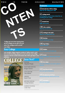
For
my content page I did not want to use a background image because I wanted to go
for a minimalistic style but I did use a cover of my magazine so there is some
kind of an image on the contents page. For the background I used black and made
it fade away to white so it doesn’t look dull. In using black for the background
I was able to make my title white which would stand out clearing.
I only used blue and white mainly for my text
because I wanted to stick to the same theme as on my cover. Also I used black
for the text for the issue column so it does not look to boring and same as
everything else on the page. I included a quote from a student which I think
shows a sense of care to it.
I went for a simple layout using three columns,
two of them mainly for the information and the other for the cover page and a
little paragraph of what you would be seeing in the magazine, in addition I
decided to have the title on the space above and tilt to the left like they do
on Vibe magazine and I thought this would suit my magazine as well as I wanted
to go for a minimal look. Also for design purposes only I decided to separate
each heading using a dotted line so you are able to look down and stop at any
particular point and not reading one headline and another description.
I found using InDesign for this quite frustrating
to use but I helped in creating a successful contents page after I got held of
how to use it. I found the guidelines on top of the layout very useful because
it made me structuring my layout simple
because all I needed to do was draw a text box, choose a font which suited the
whole page and position it, so it looked aesthetically pleasing to the target
market.
No comments:
Post a Comment