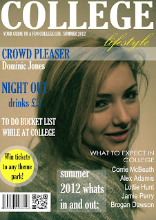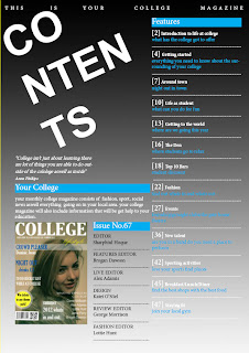
Out of the 50 images I took for my cover I decided upon
this image because I thought this would suit my college magazine the best. I
choose this because it shows that college is a place where you are to learn but
can also enjoy the areas around it and be able to socialise with your friends.
I also chose it because it represents students very well as my model seems
happy to be at college.
With choosing the text and the style I decided to keep
it to minimal but classy look. I made the headings bold so it stands out and
grabs the attention of the consumer. As I am manufacturing a social
college I wanted to make each heading on
the left side third different as
students like to read different texts and making it different from each text
makes that more attracting to the students. furthermore I intended to only choose
three colours as I stated earlier that I wanted an minimal look. I arranged the
colours one after another so there are no two heading of the same colour next
to each other.
The layout for my cover is only left side third and
bottom because I wanted to have the face of my model to be clear and no texts
on top, this shows direct mode of address as my model is making eye contact
with the audience.
The target audience for my magazine is students as it is
a college magazine, but this be for students are like going out a lot as well
as learning. That is why I choose a student who seem like they are enjoying
life at college and choose the colours by what they represent.
I really liked using Photoshop, I found it quite easy to
form the base of the magazine because there so many slides that able you to
change things around and place them in
different order after I had created each slide I made changes to the text to
suit the style. I didn’t find any major problems in using the software but it
does get bit annoying when you cant tell which slide you are on and end up
moving some other text.
